
Contents
Introduction to Power BI
Data analytics has become an integral part of modern business operations. In today’s highly competitive market, companies rely on data-driven insights to make informed decisions, streamline processes, and gain a competitive edge. One tool that has emerged as a game-changer in the field of data analytics is Power BI.
Why Power BI?
Power BI is not just another data visualization tool; it’s a powerhouse that offers several distinct advantages over other analytics tools. One of its standout features is its seamless integration with the Microsoft ecosystem. Power BI provides a natural extension to their data analytics capabilities for businesses already using Microsoft tools like Excel and Azure.
Another key advantage is the user-friendly interface that allows even non-technical users to create meaningful insights from data. Unlike complex tools, Power BI simplifies the data analysis process, making it accessible to a broader audience within the organization.
Market share is a telling indicator of its dominance. Power BI has steadily gained market share in recent years, rivaling established platforms like Tableau. Its rapid growth underscores its effectiveness and popularity among businesses of all sizes.
How much does it cost?
Pricing does vary, but in general, there are three pricing models with different levels of functionality
- Free – Power BI in Microsoft Fabric Free Account – This is what I am using today and for most people who are learning how to use Power BI
- $10 Per user Per Month – Power BI Pro – Allows users to Publish and share Power BI reports
- $20 Per user Per Month – Power BI Premium – All the Pro features, but includes some additional features such as Advanced AI and DataMart’s
Why do people use Power BI?
- Simplified Data Analysis: Power BI simplifies complex data analysis with an easy-to-use interface.
- Data Visualization Excellence: It offers impressive and interactive data visualization options.
- Seamless Data Integration: Users can connect to various data sources effortlessly.
- Accessibility and Collaboration: Cloud-based access promotes real-time collaboration from anywhere.
- Cost-Efficiency: Power BI provides scalable options and budget-friendly choices.
- Integration with Microsoft Ecosystem: It seamlessly integrates with Microsoft tools.
- Rapid Insights and Decision-Making: Quick report generation and real-time updates facilitate swift decision-making.
- Community and Support: A strong user community provides resources and assistance.
Who uses Power BI?
Many industries and roles need to adopt and use visualization software (97% of Fortune 500 Companies use Power BI and it has over 6 million users), but here are a few examples and use cases that jump to mind:
- Data Professionals: Data analysts and scientists for data analysis and visualization.
- Business Analysts: For transforming data into actionable insights.
- Executives: To monitor performance and make strategic decisions.
- Sales and Marketing: For analyzing customer data and campaign performance.
- IT Teams: To manage resources and monitor system performance.
- Healthcare and Life Sciences: For clinical research and patient care.
- Manufacturing and Supply Chain: To monitor and optimize operations.
- Financial Analysts: For financial reporting and analysis.
- Education: To track student performance and resource allocation.
- Businesses of All Sizes: From startups to large enterprises.
- Nonprofits and NGOs: For donor data and program impact analysis.
What components make up Power BI?
Power BI might seem complicated, but essentially, there are only two key components to worry about:
- Power BI Desktop: The heart of Power BI, this Windows application, is where you create reports and dashboards. It allows you to connect to data sources, transform data, and design compelling visualizations.
- Power BI Service (Power BI Online): Power BI Service is a cloud-based platform that lets you publish, share, and collaborate on reports and dashboards created in Power BI Desktop. It enables real-time data sharing and accessibility across devices.
The following components are useful but are not immediately essential to understand:
- Power BI Mobile App: Available for iOS and Android, the mobile app ensures you can access your reports and dashboards on the go. It offers an optimized viewing experience for smartphones and tablets.
- Data Transformation (Power Query): Power Query is a powerful data transformation tool within Power BI Desktop. It enables data cleaning, shaping, and merging from multiple sources to create a unified dataset for analysis.
- Data Modeling (Power Pivot): Power Pivot is used for data modeling and creating relationships between tables. It’s essential for building robust data models that support complex analyses.
- DAX (Data Analysis Expressions): DAX is a formula language for creating custom calculations and measures. It empowers you to perform advanced calculations on your data.
- Power BI Gateway: The gateway facilitates data refreshes for on-premises data sources. It ensures that your reports in Power BI Service stay up-to-date.
- Power BI Embedded: This option allows developers to embed Power BI reports and dashboards into custom applications, extending Power BI’s functionality.
Downloading and setting up Power BI
Getting started with Power BI is a straightforward process. To begin, you’ll need to download and install Power BI Desktop. Follow these simple steps:
- Visit the official Power BI website.
- look for “Microsoft Power BI Desktop”
- This should open the Microsoft store on your windows computer
- Install Power BI
- Follow any on-screen instructions to complete the installation.
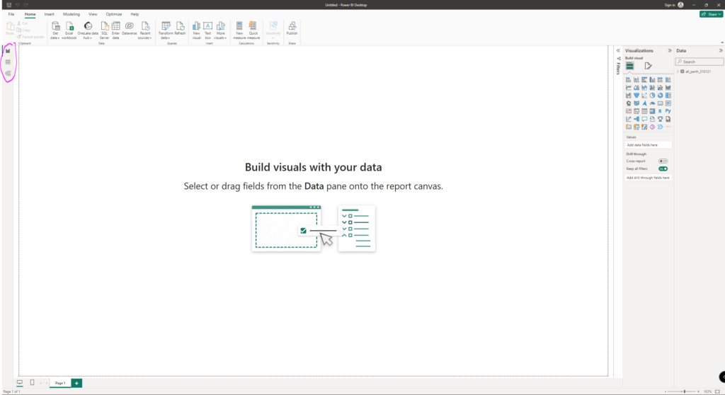
Once you’ve installed Power BI Desktop, launch the application, and it’ll open to the below welcome screen

Let’s get started with your first data visualization.
Connecting to Data Sources
Power BI’s strength lies in its ability to connect to various data sources. Whether your data is stored in Excel spreadsheets, databases, cloud services, or web sources, Power BI can seamlessly integrate it into your analysis. Here’s how to connect to different data sources:
- Excel: Open Power BI Desktop, click “Get Data,” and choose “Excel.” Browse for your Excel file and select the data you want to import.
- Databases: Power BI supports various databases like SQL Server, MySQL, and Oracle. Connect by selecting the appropriate database type and providing connection details.
- Web: Extract data from websites or web services by selecting the “Web” option. Specify the URL and data parameters.
- Other Sources: Explore Power BI’s connectors for cloud services, online services, and more.
Today, we are going to use a dataset from Kaggle. This dataset is a few years old and represents pre-prepared housing market data for the Australian city of Perth. For this post, how to prepare the data is not relevant as we want to get started. However, ensuring your data source is well-prepared, clean, and structured for analysis is generally a good idea.
Okay, let’s connect to the data:
- Download the data to an accessible folder
- Extract the .zip file
- In the Power BI Splash screen or from the Toolbar at the top, select “Get Data.”
- Select “Text/CSV”
- Find your dataset
- A configuration menu will open, where you can specify details relating to how the text file is set up
- Select “Load”
- Power BI will then take a moment to load up
Familiarizing yourself with the interface
You’ll see that Power BI hasn’t automatically created anything for you. However, you will see that there are three different view (in pink, top left):
These are:
- Report view (default) – Create reports and visuals with configuration options.
- Data view – see data from the model you’ve built.
- Model view – build relationships between database tables in something called a STAR schema (however, in our example, we are using pre-prepared data).
In the data view, you might need to make a few configuration changes to how Power BI interprets the data
Creating a Visualization
With your data source connected, it’s time to visualize your insights. Power BI offers a user-friendly canvas and workspace where you can design your reports and dashboards.
Visualization is an art form in itself with many different methods and styles. Power BI makes generating many various analyses with the below elements accessible with the below functionalities:
- Drag and Drop: Drag and drop fields from your dataset onto the canvas to create visuals.
- Visualization Types: Power BI offers various visualization types, including bar charts, pie charts, line graphs, and more.
- Formatting: Customize your visuals by adjusting colors, fonts, and labels to convey your message effectively.
If you go into this directionless, you can make lots of different visualizations that, while interesting, are probably not useful. So, to protect ourselves from analysis paralysis, let’s create a hypothesis and try to prove the hypothesis (or not)
- Hypothesis: The relationship between the average price and each suburb’s average land area within 4 km of the central business district (CBD) varies. I.e., a buyer might get more (or less) land area for the same money.
- Goal: I want to identify the top 5 cheapest suburbs per square meter of land for sales after 2019
I won’t go into full detail about all the steps I followed to get to the below as it’s out of scope for this post, but just quickly:
- I created a new measure dividing the price by the land area for each record
- Then, I changed some of the aggregation methods
- I created two different panels
- the first to show the range of all the suburbs
- the second to offer the top 5 cheapest suburbs
- I asked Power BI to create a summary of the data automatically
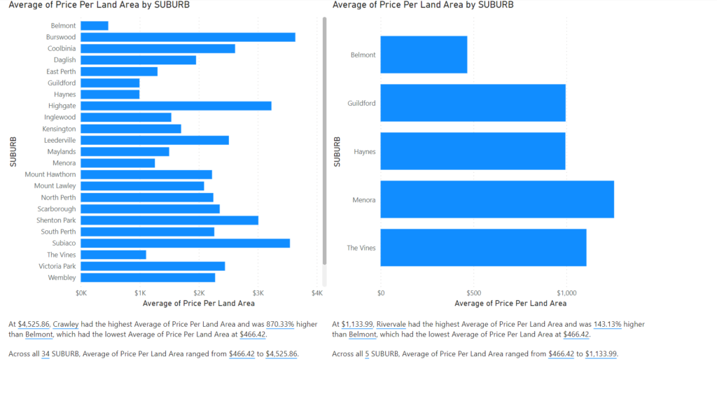
As to our hypothesis, the price per land area does significantly: Across all 34 Suburbs, the Average Price Per Land Area ranged from $466.42 to $4,525.86. As to our goal, we identified the top 5 cheapest suburbs within 2 km of the CBD based on sales since 2019.
Remember to keep your visualizations clear and concise, ensuring they tell a compelling data story.
Best Practices and Tips for Getting Started
As you embark on your Power BI journey, here are some best practices to keep in mind:
- Data Cleansing: Invest time cleaning and transforming your data to ensure accurate analysis.
- Data Security: Maintain data security and privacy by limiting access to sensitive information.
- Regular Updates: Schedule data refreshes to keep your reports up-to-date.
- Documentation: Document your data sources, transformations, and calculations for future reference.
By adhering to these best practices, you’ll maximize the efficiency and effectiveness of your Power BI projects.
Next Steps and Resources
For those eager to dive deeper into Power BI and advance their skills, there are numerous resources available:
- Online Courses: Consider enrolling in online courses on platforms like Coursera, Udemy, or LinkedIn Learning.
- Books: Explore books dedicated to Power BI, offering comprehensive insights and practical examples.
- Communities: Join Power BI user communities and forums to connect with experts and enthusiasts.
- Certifications: Pursue Microsoft’s official Power BI certifications to validate your expertise.
Conclusion
In conclusion, Power BI is a versatile and powerful tool that empowers businesses to harness the potential of their data. Its user-friendly interface, extensive connectivity options, and robust visualization capabilities make it a valuable asset for anyone seeking to make data-driven decisions. Whether you’re a business professional or an aspiring data analyst, Power BI is your gateway to unlocking actionable insights from your data.
Begin your Power BI journey today and embrace the data-driven future of business analytics.